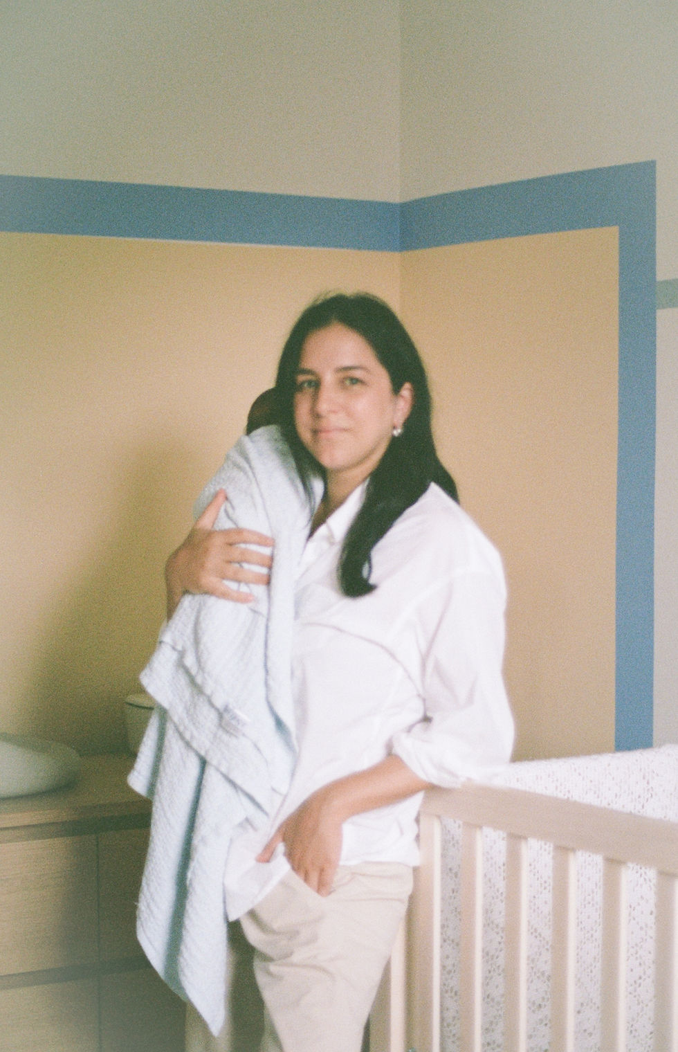
Design Notes from Nicolò’s Room
- Sep 3, 2025
- 2 min read
Updated: Sep 14, 2025
Preface: I'm emotional writing this.
When I first started pulling together my son Nicolò’s room, I didn’t have a finished vision in mind. It evolved slowly, and honestly, which felt right for a child’s space—something organic, playful, and responsive to the way he moves through it.
We had already bought the dresser and crib before the design even began. Those two wood pieces became early anchors, and rather than fight them, I leaned in, matching their tone to the oak flooring and natural wood used throughout the rest of the house. But with so much wood, I knew I needed balance. So we kept the built-in closet a solid greige—quiet and grounding, and a clean visual break from the wood grain.

The Starting Point: A Pillow and a Rug
The palette came together in a truly unplanned way. A close friend (and former client) gifted Nicolò a yellow “N” pillow when he was born. Around the same time, I came across a blue rug (on sale!) at West Elm that felt like it belonged. Between the two, we had a starting point: warm, unexpected, muted colours, rooted in comfort and joy.

A Wall That Feels Like Play
I wanted the room to feel imaginative without being overstimulating. The walls became the place to bring in that sense of fun, specifically through shape and colour.
The forms are inspired by Ettore Sottsass: hard geometry, playful proportions, unexpected combinations. I had his book cover taped to the wall as my inspo while sketching the mural (photos at the bottom of this page), letting the energy of his work guide the lines and layout.
Ettore Sottsass and The Social Factory print that inspired it all


Comments